Why Two Colours Can Feel Balanced Without Being Equal
Why two colours can feel balanced without being equal: learn to judge brightness, visual weight and area, then adjust a room or outfit with confidence.
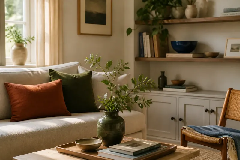
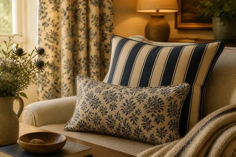
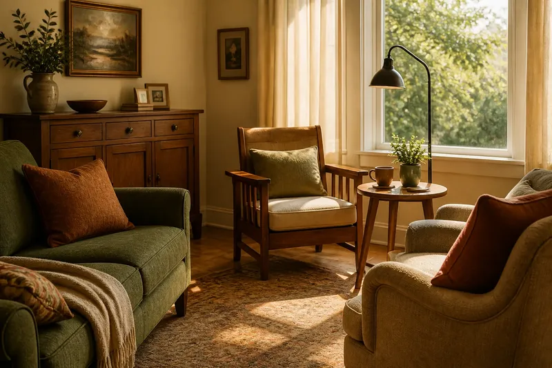
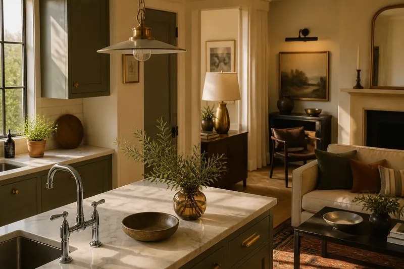
Why two colours can feel balanced without being equal is a useful question when a small dark detail keeps pulling attention from a much larger pale surface. In a room, an outfit or a table setting, colour balance depends on more than how much of each colour appears. Brightness, saturation and placement all affect the visual weight each one carries.
A balanced pairing does not need equal areas, and it need not make both colours equally noticeable. The aim is to decide where attention should settle, then adjust the colours’ relative presence. A simple week-long routine can help you make that decision without repeatedly repainting, rearranging or buying another cushion in a shade called “stone”.
Start by noticing where the eye goes
On the first day, look at the combination in its ordinary setting. Stand back from the room, or view the whole outfit in a mirror rather than inspecting each item separately. Notice which colour catches your eye first and whether your attention stays there or moves naturally across the scene.
Visual weight is the sense that one colour occupies more attention than another. A dark, saturated colour can feel weighty in a limited area. A pale, quiet colour may cover a much larger surface without demanding the same attention. These are tendencies, not fixed rules: context, lighting and neighbouring materials can change the impression.
Write down what you want the pairing to do. Perhaps the sofa should remain the main feature while a rust-coloured cushion gives it definition. Or perhaps a navy jacket should anchor a pale shirt without making the outfit feel sombre. Naming the intended focus is more useful than deciding that the colours ought to be “balanced” in the abstract.
Compare brightness before changing the area
On the second day, compare the colours by brightness: how light or dark each appears. A white wall and a deep green vase differ strongly in brightness, even if they share a calm undertone. The vase may hold attention despite taking up much less space.
To make a quick comparison, view the pairing from across the room or squint slightly. Fine detail becomes less distinct, while broad light-dark differences remain easier to notice. A phone photograph can also help, but screens alter colour; use the image to compare broad areas, not to choose a precise shade.
If one colour dominates more than you want, try changing its area before replacing it. Move a dark object farther from the central sightline, or repeat it in smaller, separated touches. Alternatively, introduce a lighter version of the same colour nearby. The point is to reduce its concentrated visual force, not to add an equal-sized patch of something else.
Check saturation and surrounding colours
On the third day, consider saturation: whether a colour looks vivid or muted. A small, clear red accent can pull attention from a broad field of muted blue. A large area of dusty pink may feel quieter than its size suggests because its colour is less intense.
Look at the colours immediately beside the pairing. A warm cream wall can make a cool grey object seem bluer; a dark wooden table can make a pale cloth appear brighter. The colour you are judging is never entirely alone, even when it is the only item you meant to assess.
Say you have a small cobalt-blue bowl on a wide pale-grey sideboard, and the bowl looks too prominent. Imagine moving it from the front edge to a shelf with a few quieter objects, then placing a modest blue book spine elsewhere in the room. The expected observable result is that the blue remains present but no longer concentrates the room’s attention in one spot.
Use placement to distribute visual weight
On the fourth day, examine where each colour sits. A dark item at eye level may attract more attention than the same item low down. A strong colour at the edge of a table can make the whole arrangement feel lopsided, while a smaller echo on the opposite side can make the colour seem more settled.
Try moving one object at a time. Shift a bright cushion, a coloured mug or a patterned accessory, then look again from the usual viewing position. If you change several things together, it becomes difficult to tell which change helped. This is not a laboratory protocol; it is simply a way to avoid losing the plot among cushions.
In clothing, placement works similarly. A vivid scarf near the face may become the outfit’s focus, while the same colour in shoes gives a quieter finish. Neither choice is inherently better. Choose according to where you want the eye to go and how much attention the occasion calls for.
Build a short routine for the rest of the week
Use the remaining days to make small comparisons in the actual setting, at the times you normally see it. Morning daylight and evening lamplight can alter the relationship between colours. Do not try to correct every change: first decide which view matters most for the room, outfit or occasion.
- Day one: Name the intended focal colour and note what draws attention first.
- Day two: Compare brightness from a distance and identify the colour that feels heavier.
- Day three: Check whether saturation or nearby colours are intensifying that effect.
- Day four: Move one item and observe whether its position changes the balance.
- Day five: Try a smaller repeat of the stronger colour in a separate place.
- Day six: Revisit the pairing in its usual light and remove any adjustment that feels fussy.
- Day seven: Keep the arrangement that supports the intended focus, even if the colour areas remain unequal.
The routine is a sequence of observations, not a requirement to make a change every day. If the pairing already feels settled, leave it alone. Colour is not improved merely by being given more opportunities to be rearranged.
What should you change when one colour dominates?
Should I add more of the quieter colour?
Not necessarily. First try reducing the dominant colour’s concentration, moving it, or repeating it in smaller touches. Adding a large new area may create a second problem rather than resolve the first.
Can a small dark object balance a pale room?
It can, particularly if its position gives it a clear role. A dark object may act as an anchor in a pale setting, though several dark items clustered together can become a separate focal area.
Does equal colour area mean equal visual weight?
No. Two colours covering similar areas can still differ in brightness, saturation and prominence. Equal area is a count of space, not a reliable measure of attention.
How can I judge the pairing in changing light?
Look at it under the light in which it will usually be seen, then check another ordinary time of day. If the effect changes, decide which setting matters more instead of chasing a single appearance that lasts everywhere.
Keep the balance suited to its purpose
On the final day, judge the pairing by its job. A quiet corner may need only one dark accent to feel grounded. A lively meal setting may support a stronger contrast, while an outfit for a formal occasion may benefit from a restrained colour near the face and a more vivid detail elsewhere.
Why two colours can feel balanced without being equal comes down to their combined visual weight, not a matching share of space. When you assess brightness, saturation, surroundings and placement in sequence, you can make a measured adjustment and stop when the colours support the setting. The useful finishing check is simple: look from the place where the arrangement will actually be seen, and keep the version that makes sense there.