Stripes or Florals: Let Scale Set the Terms
Stripes and florals can share a room when their repeats differ in scale. Learn how to judge pattern size, spacing and visual weight before pairing them.
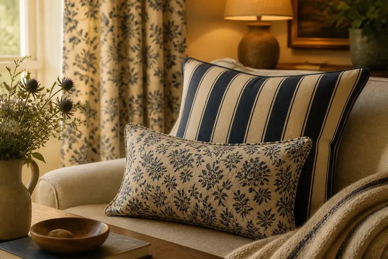
Stripes and florals can sit together on a sofa, bed or table without either one taking over. The useful question is not which pattern is quieter by nature, but how large each repeat appears beside the other. Pattern scale gives the two designs different jobs: one can carry the broad view while the other supplies detail.
That distinction matters because a fine stripe can be more insistent than a large flower, and a scattered floral can read as nearly plain from across a room. Use the following points to judge what the patterns are doing at the distance and in the setting where they will be seen.
1. Judge the repeat from the viewing distance
A pattern repeat is the span before its arrangement begins again. On a floral fabric, it may be the distance between one recognisable flower and the next. On stripes, the repeat may be a band of alternating widths or colours. The printed motif is not necessarily the repeat: a small flower can be spread across a generous field, while a large bloom can recur close to its neighbour.
Start by looking at each fabric from the place where it will usually be noticed. A cushion is seen from across a room as well as from the chair. A curtain is viewed across its full drop, not only at the hem. At a distance, closely repeated motifs may merge into a texture; a broad, open design may remain legible.
Hold a sample at arm’s length, then put it beside the other fabric and step back. If both patterns remain equally legible, they may be asking for equal attention. If one resolves into a quieter field while the other keeps its shape, the scale relationship is already doing useful work.
2. Give one pattern the broader beat
When combining stripes and florals, a clear difference in repeat size often makes the pairing easier to read. A broad stripe can establish a measured rhythm while a smaller floral supplies close detail. The reverse can work too: a generous botanical motif may be the main event, with a narrow stripe acting as a fine, orderly counterpoint.
“Large” and “small” are relative, not fixed categories. A stripe’s bands might be broad but alternate in a simple sequence, while a floral’s compact blossoms repeat in a busy arrangement. In that pairing, the floral may carry more visual activity despite its smaller motifs. Consider the whole surface, including the gaps, rather than naming a winner from one motif alone.
Say you have a broad navy-and-cream stripe for a bench cushion and a small floral in the same two colours for a nearby seat pad. From the doorway, the stripe is likely to read as a steady set of bands, while the blossoms offer a finer layer at closer range. If the floral still draws the eye first, its density or contrast may be outweighing its nominally smaller scale.
3. Read the empty space as part of the pattern
Pattern scale includes the ground between motifs. A floral with wide areas of plain background can feel spacious even when its blooms are substantial. A tiny all-over print can feel dense if the ground nearly disappears. Stripes also vary in the space they leave: close pinstripes create a fine grain, while broad bands have more breathing room.
Compare the proportion of pattern to ground on both fabrics. If one surface has busy marks with very little pause, pairing it with an equally crowded design can make the eye keep searching for somewhere to rest. A more open stripe or a floral with clear gaps can provide that pause without introducing a third pattern or a plain-coloured rescue cushion.
Look at how the design behaves across the object, too. A curtain gathers into folds, compressing its visible ground. A cushion turns a flat repeat into a small, curved surface. A table runner may show only a narrow length of a much larger design. The same fabric can therefore appear more crowded in use than it does as a flat sample.
4. Compare visual weight, not just motif size
Two patterns can have different-sized repeats and still compete. Dark, high-contrast stripes may command attention from across the room. A floral with strong outlines, saturated colours or many overlapping shapes can do the same. Scale helps, but contrast, density and colour also determine which surface appears prominent.
Ask what remains visible when you soften your focus. A pattern with a bold light-dark division often holds its shape. A low-contrast print may recede into a texture, even if its flowers are large. If both fabrics retain strong outlines and vivid contrast, the size difference may not be enough to give them separate roles.
There is no need to force one design into submission. Instead, choose which surface should be noticed first and adjust the setting around it. A smaller item, such as a lumbar cushion or lampshade, can carry the more assertive pattern. A larger curtain or upholstered seat can use the simpler repeat, so the amount of fabric does not turn it into the loudest feature by sheer area.
5. Match the direction and shape of the setting
Stripes have an obvious direction. They can run horizontally, vertically or diagonally, and their orientation changes how a surface reads. Florals are usually less linear, but stems, branches and the spacing between blooms can still create a strong direction. Notice whether the two patterns reinforce the same movement or pull the eye in different ways.
A vertical stripe beside a trailing floral may create a deliberate contrast between order and movement. On a small cushion, that can be lively. Across long curtains beside a large floral chair, the same combination may look more active because both patterns cover substantial surfaces. A stripe that follows the shape of an item can also seem more settled than one whose direction cuts across it.
Before committing, place paper or fabric samples on the actual object, rather than judging them only side by side on a table. Turn the cushion to see whether the stripe direction still suits its shape. For curtains, let the sample hang vertically. Fabric drape and the angle of view can alter the balance; a flat comparison cannot tell the whole story.
6. Check the pairing in its actual light
Colour affects how easily the repeat can be read. A pale stripe on a pale ground may blur into a soft band, while a dark floral outline remains crisp. In a dim corner, the floral might then become more prominent than it looked in a bright shop. Daylight, lamplight and the colour of nearby walls can all change the apparent strength of a pattern.
Take samples to the room and view them near the surface they will meet: painted wall, timber, upholstery or bedding. Check them in daylight and again after the room’s lamps are on. The aim is not to make every colour identical. It is to see whether the patterns keep their intended difference in scale and attention under the light where they will live.
If a retailer’s sample is too small to show the full repeat, ask whether a larger cutting or full-width photograph is available. A cropped square can make a large repeat look like a random fragment, or make a dense print seem calmer than it will appear over a larger area.
Which scale works for stripes and florals?
Can small stripes go with large florals?
Yes, when the fine stripe reads as a quieter texture and the floral has room to show its shape. Check the stripe’s contrast and spacing: tightly packed, high-contrast lines can still command attention.
Can two small patterns work together?
They can, particularly if one has more open ground or softer contrast. If both are dense and sharply defined, they may merge into visual noise rather than form a clear pairing.
Should the larger pattern go on the larger object?
Not automatically. A large repeat can suit a broad curtain, but a small patterned cushion can carry it as an accent. Judge the visible area, the repeat and the prominence you want, rather than matching motif size to furniture size.
How can a pairing be checked before buying?
Compare the samples together at the intended viewing distance, then place them on the object and in the room’s light. If possible, borrow larger samples so the repeat and ground are visible rather than inferred from a small swatch.
7. Make a small trial before repeating the pattern
A pairing often becomes clearer when seen on one object rather than across a collection of samples. Try the stripe and floral on a single cushion, a reversible seat pad or a short table runner before ordering enough fabric for several large surfaces. This is not a demand for a matching set. It is a way to see how scale behaves in the actual setting.
Keep the first trial simple. Put the two fabrics together, move the object to its usual place and view it from the doorway as well as nearby. If the designs still read as one lead and one supporting pattern, the scale relationship is doing its work. If both ask to be noticed at once, change one variable: choose a more open repeat, reduce contrast, or give one pattern less visible area.
For stripes and florals, scale is not a rule that says one must always be large and one small. It is a way to assign attention. Compare repeat, ground, contrast and viewing distance, then let the arrangement decide which pattern leads. A pairing feels settled when the eye can move between them without being asked to conduct a debate.